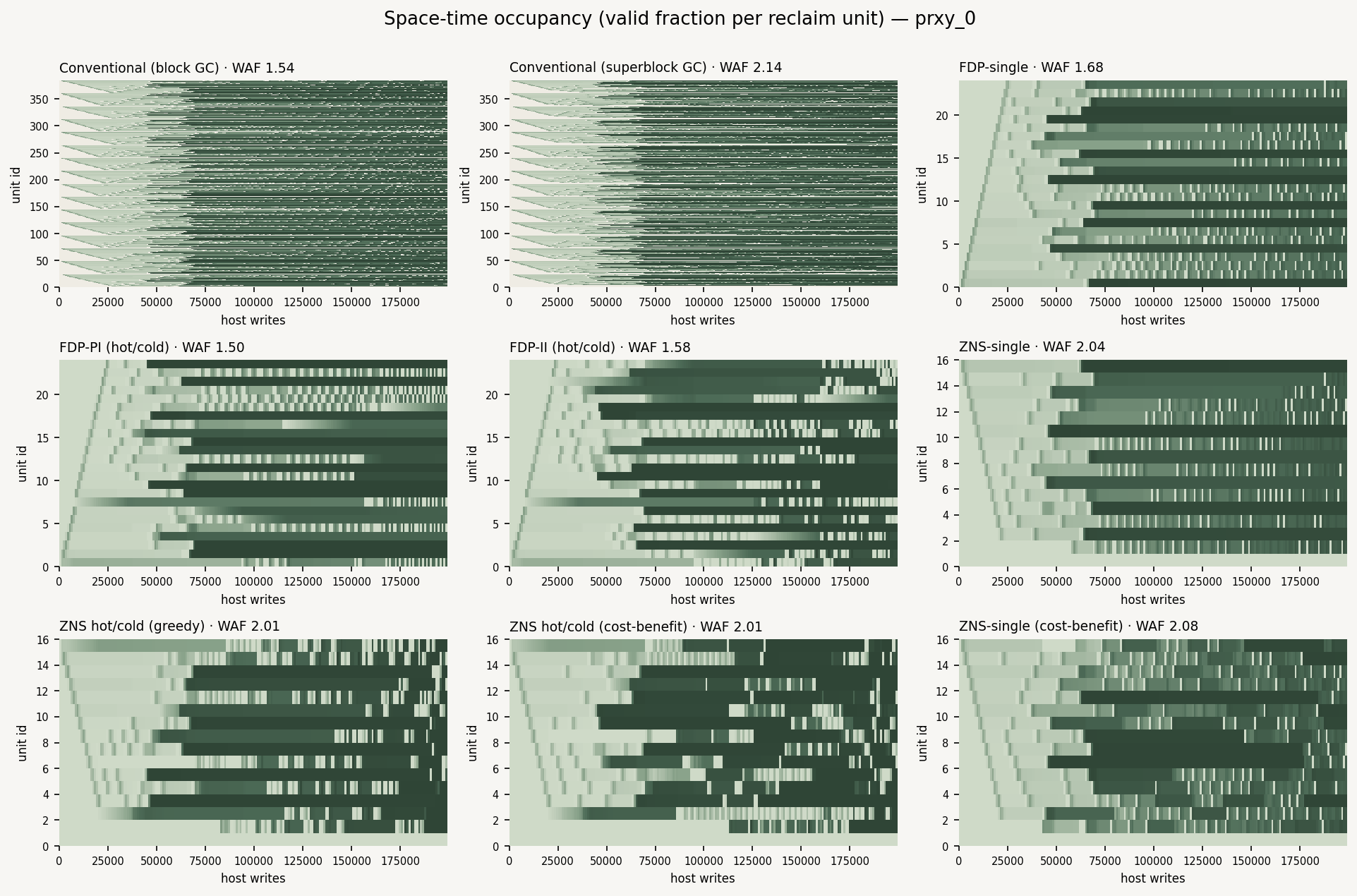
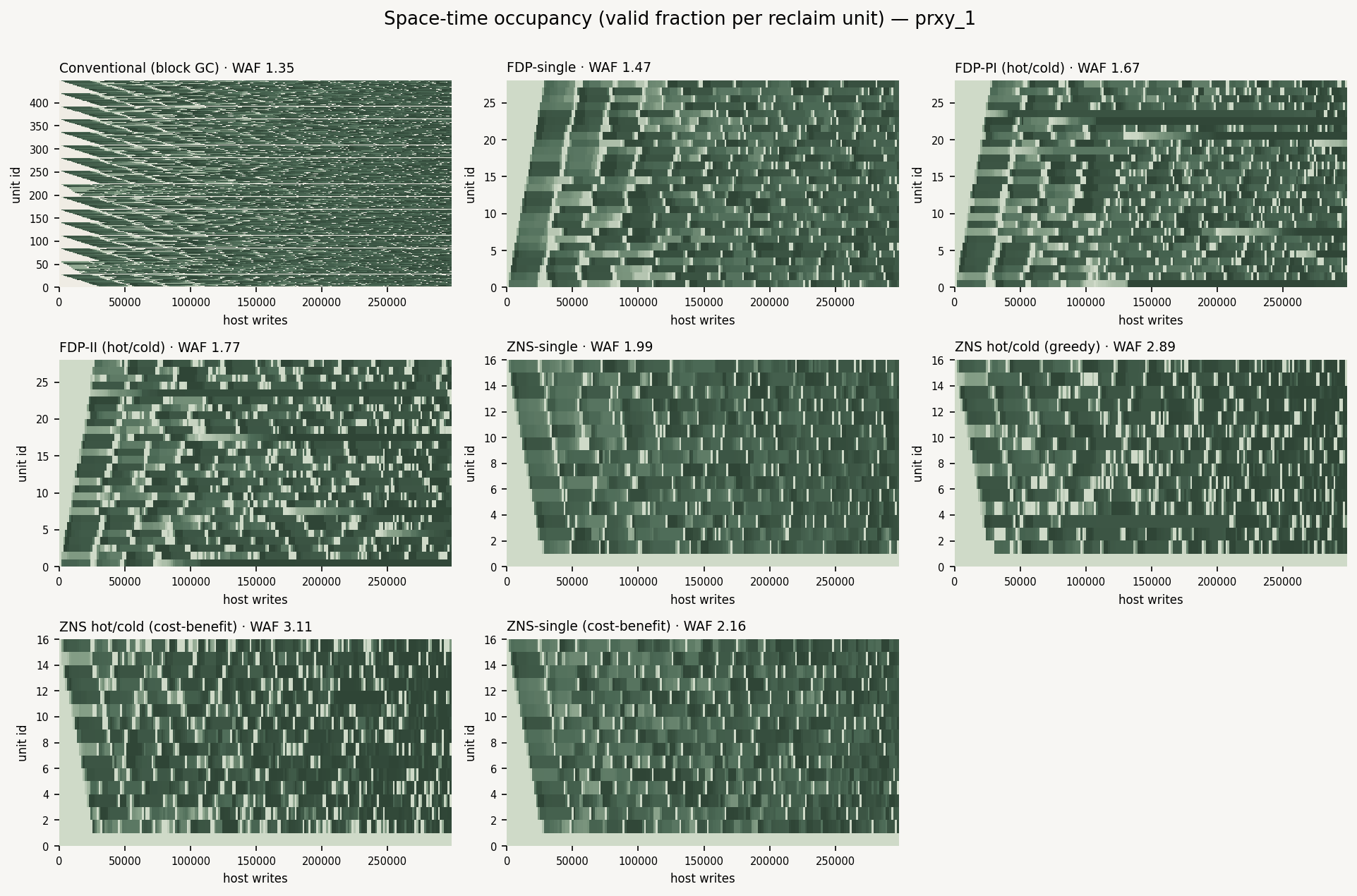
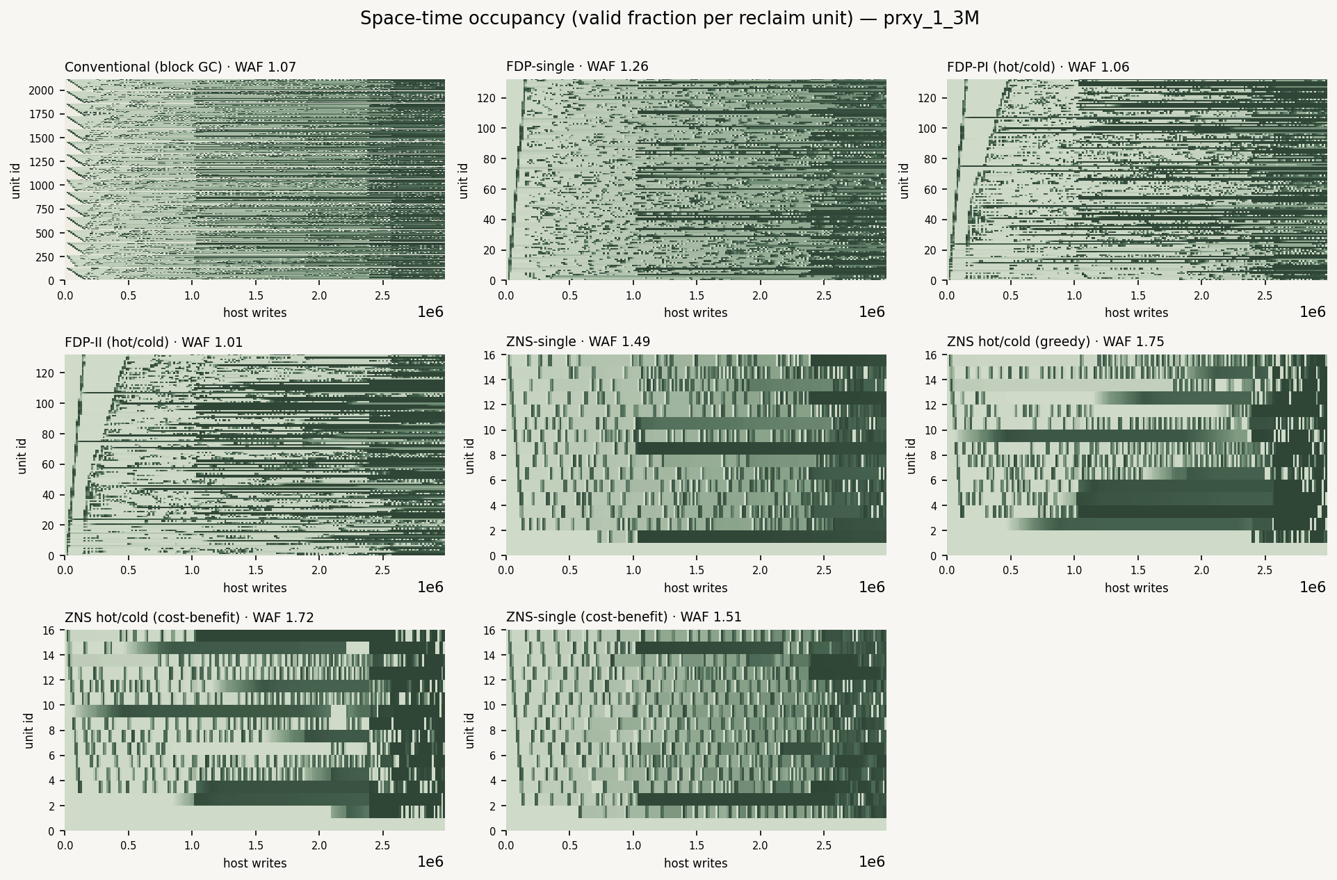
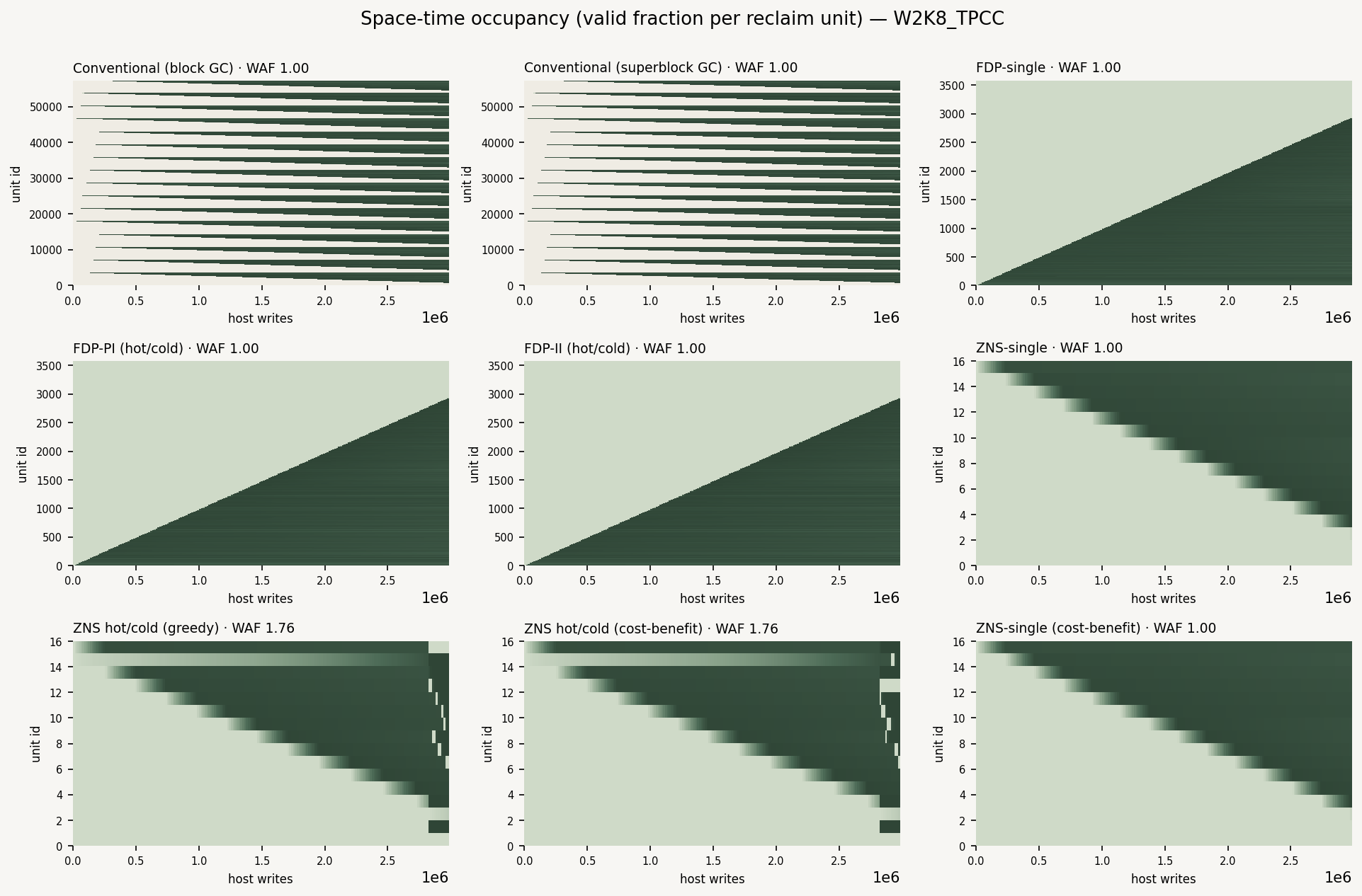
Space-Time Occupancy Heatmaps
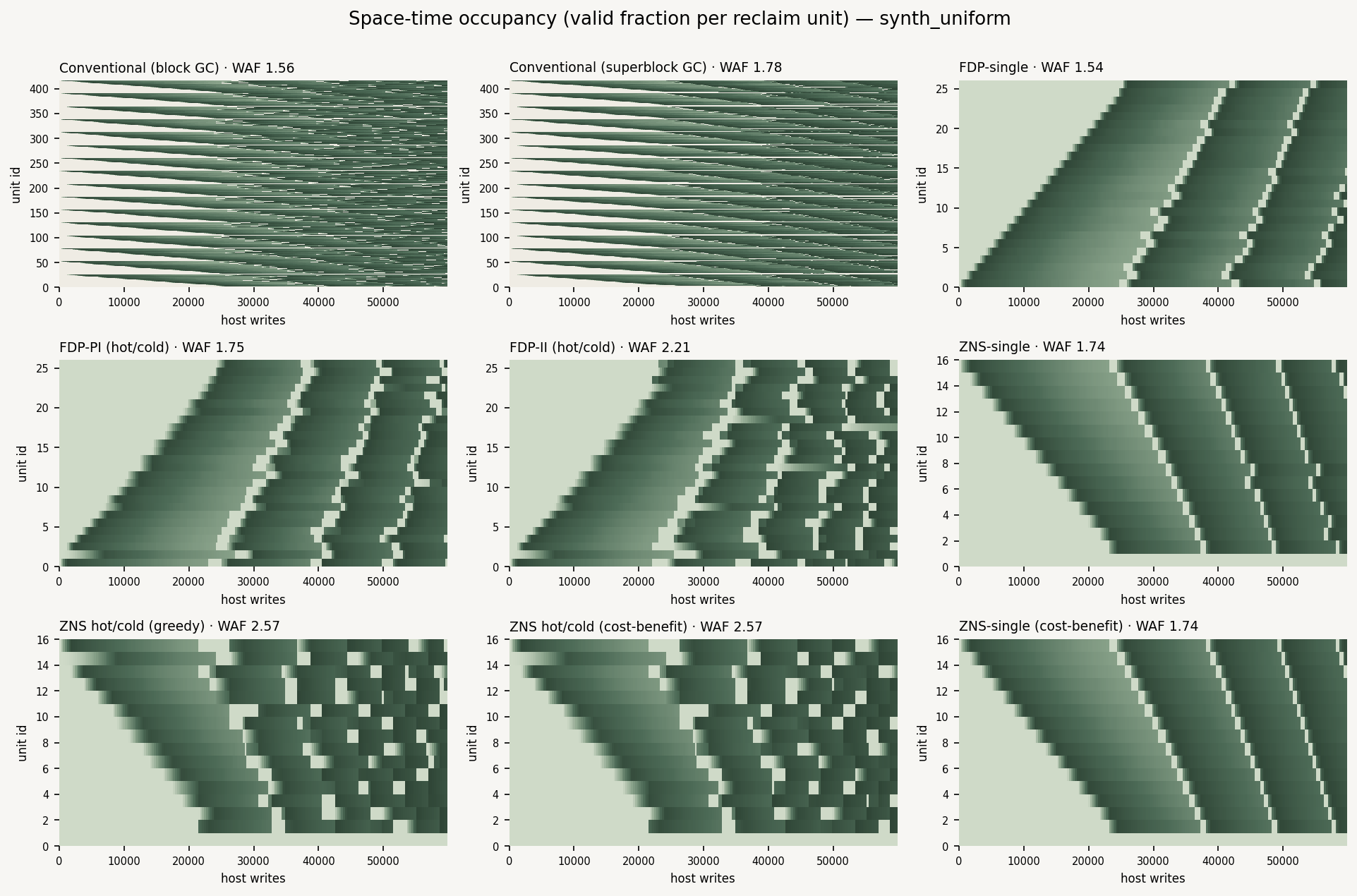
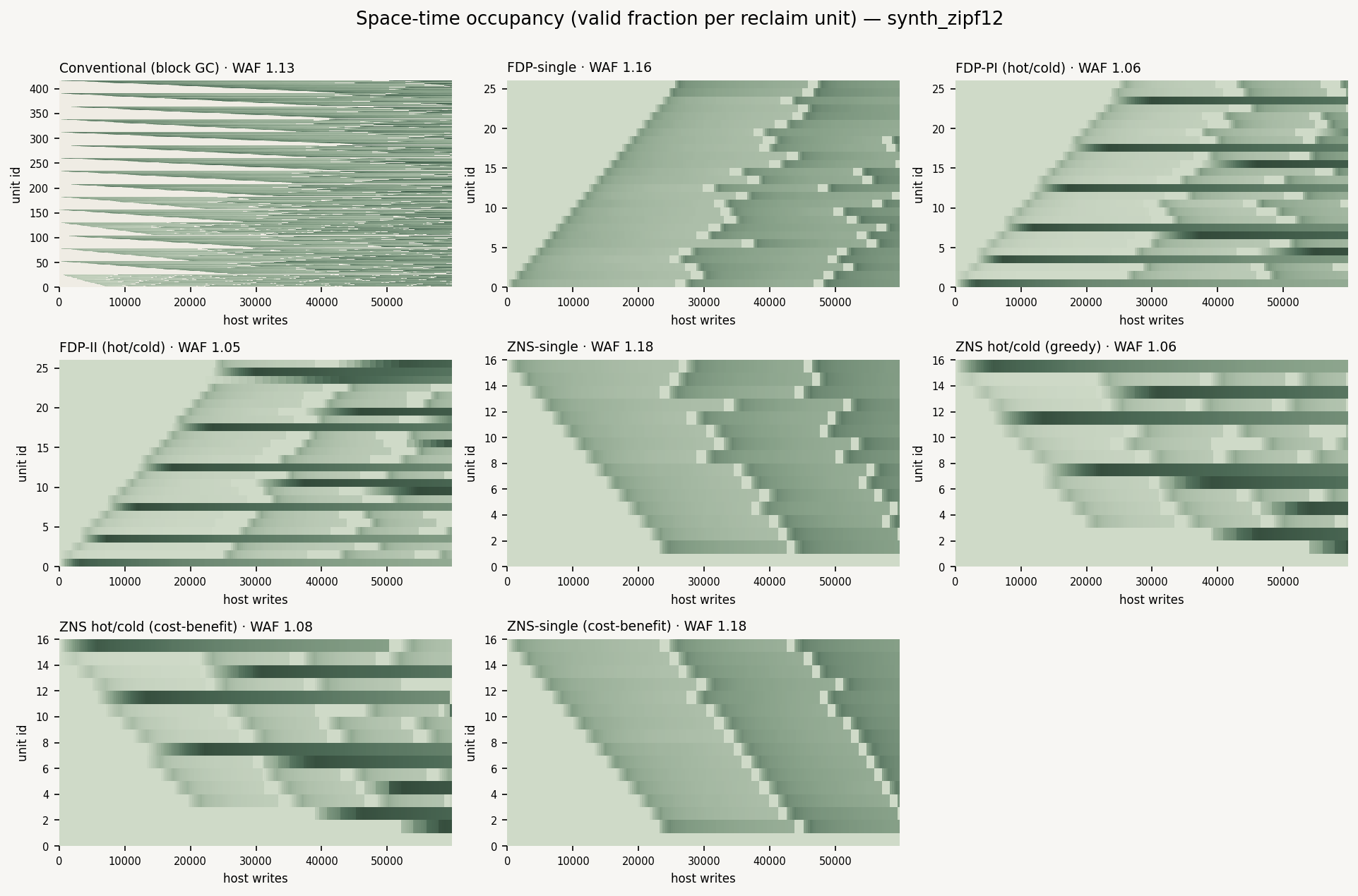
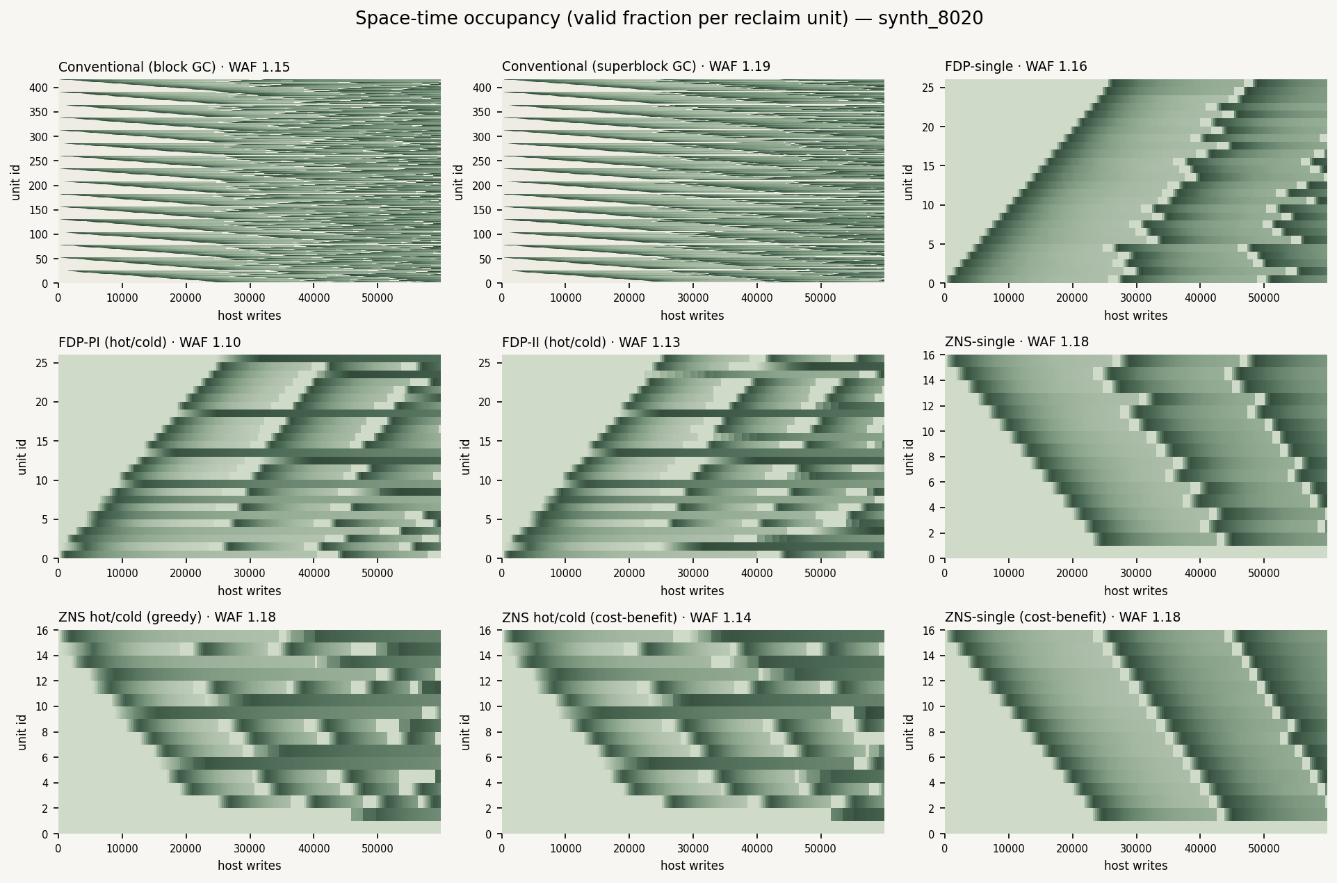
Our finding. Placement policy is written into the distribution of valid data, not just the scalar WAF. FDP-PI and ZNS hot/cold visibly park cold data in a stable band and confine churn to a small hot band, while conventional block GC mixes hot and cold across every unit — so every reclaim carries some valid pages.
How this helps our work. This is our central lens: characterising how wear and invalidity spread over space and time, which a single WAF number cannot convey. It makes the mechanism behind each policy's WAF directly visible and is the qualitative backbone of the paper's distribution argument.
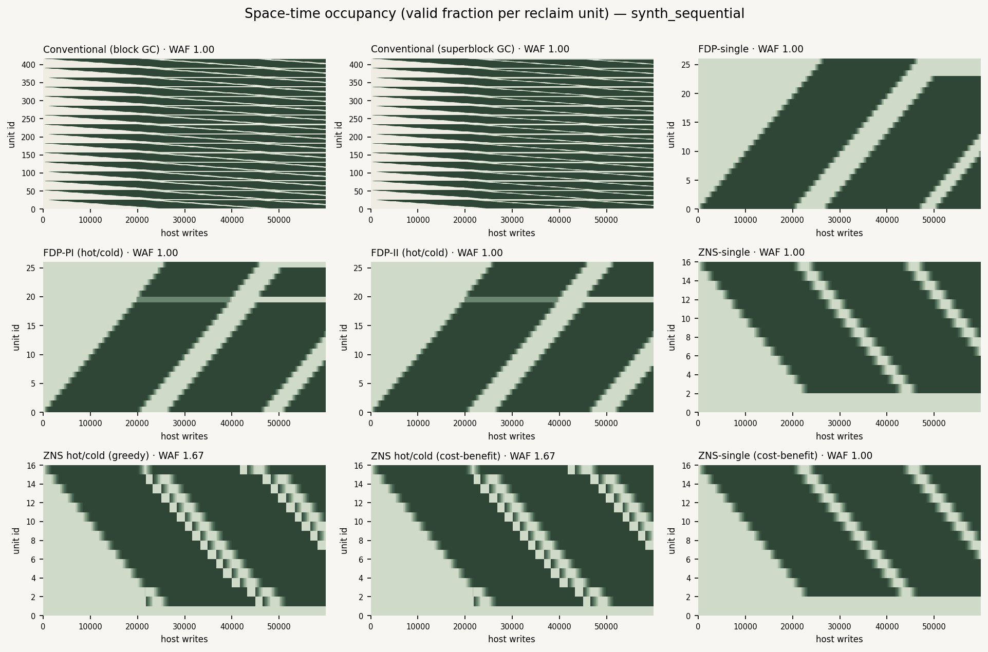
What it shows. One panel per engine; vertical axis = reclaim unit (block/RU/zone), horizontal = host-write time, colour = valid fraction (light = empty/invalid, dark green = full). You can watch the device fill (the diagonal ramp), reach steady state, and see how each policy organises hot vs cold data.
- Placement is visible. FDP-PI and ZNS hot/cold form a stable dark cold band (cold data parked, never re-migrated) plus a small churning hot band — the separation the scalar WAF only hints at.
- Conventional block GC shows a fine, uniform speckle: hot and cold data mixed across all units, so every reclaim carries some valid pages.
- Sequential / TPC-C fill cleanly then stay dark and stable (no rewrites, WAF 1.0); uniform stays uniformly mid-toned (everything ~half-valid → expensive GC).